
Get art and craft supplies delivered free — and shop member deals
- Fast, free delivery on millions of items
- Access to Prime Big Deal Days deals on October 6–7
- Prime Video, Amazon Music and more included
A descent designed to slow you down
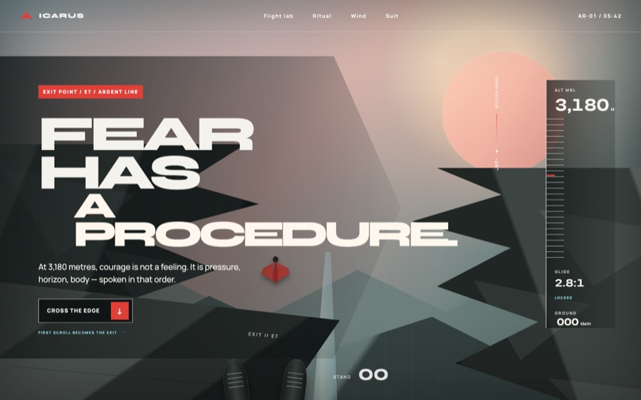
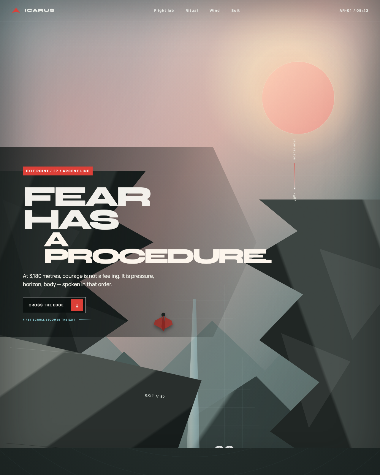
Room 131 is an AI-built exhibition piece, not a record of a real flight or a real company. “Project Icarus” and its Ardent Line belong to a fictional world: a proximity-flight attempt staged as a study in pressure, judgment, and the choice to stop. The site’s signature move is to make the first scroll feel like a descent. A cliffside scene shifts beneath the visitor while flight phases and altitude readings advance alongside it, turning navigation into a small piece of theater.
That spectacle has a quieter purpose. The page begins with the visual instability of a dawn drop, then moves toward the legibility of a field manual. Its central tension isn’t simply whether the fictional pilot can fly close to the terrain. It’s whether they can respect a boundary, follow a check, and walk away. In that sense, the room uses motion not as decoration but as a way to give restraint a narrative shape.
interactive flight simulation display
As an affiliate, we earn on qualifying purchases.
As an affiliate, we earn on qualifying purchases.
Reading the line
The visual system depends on a deliberately narrow palette. Granite gray builds the cliff, and near-black gives the text and instruments a grounded base. Dawn rose softens the horizon; sky cyan marks a safer margin; jumpsuit crimson is held back for consequential choices and the intended route. That restraint makes color function like a set of editorial annotations: atmospheric tones establish place, while the brighter accents tell visitors where risk and recovery sit.
Type helps separate the imagined spectacle from its practical language. Wide, assertive display lettering gives the project the voice of a flight title or expedition banner. A more composed sans serif handles labels, instructions, and readouts. Both faces are self-hosted, keeping the experience’s typography under its own control rather than making the visual identity depend on an external font service.
One progress model, many layers
The scroll sequence is the room’s defining piece of craft. A sticky scene holds the visitor in place while the terrain, boots, aircraft figure, and foreground move at different rates. The altimeter and phase label draw from that same scroll progress, so the narrative image and its telemetry advance together instead of behaving like separate effects. The cliffs themselves are constructed from CSS shapes, gradients, and overlapping facets; there is no generated image library standing in for the landscape.
A second interaction turns the route into something visitors can compare. Adjusting the glide-path control redraws an SVG route and its cyan safety envelope, while the associated distance, clearance, and flare-reserve figures respond with it. This is presented as a visual projection, not as practical aviation guidance—a useful distinction for a fictional instrument that borrows the confidence of technical interfaces.
Checks that mean something
The smaller controls reinforce the same idea. Suit hotspots reveal an anatomy panel that works with keyboard and touch, and the spoken-check controls behave as toggles rather than inert decorative buttons. Their verdict changes only after the necessary confirmations have been made. A separate stand-down gesture asks visitors to hold for a moment before closing the route. In each case, an action has a clear consequence: the interface makes caution something a person must actively choose.
Motion is also treated as a design decision. Reduced-motion settings change the drop into a gentler fade and remove speed cues while preserving the final scene. Ambient movement pauses when the page is hidden, and the stand-down timer can be cancelled if visibility changes. The result is a room that can feel cinematic without insisting that every visitor experience it at the same speed.
Want this? Paste this into your AI coding agent
Build a single-page showcase website from this art-direction brief. Work like an elite creative frontend engineer; commit totally to the direction.
BRIEF (room 131 of 175, “icarus”):
ICARUS — PROJECT ICARUS, a wingsuit proximity-flight record attempt (fictional athletes, real physics). Aesthetic: dawn granite and thin air; fear managed by checklists. Palette: dawn rose, granite grey, jumpsuit crimson, sky cyan. Fonts: syne (display), manrope (body). SIGNATURE: EXIT POINT — the hero is the cliff edge seen from above; the first scroll IS the exit: the page drops — altimeter rail spinning down, granite walls rushing up as parallax layer stacks, glide-ratio readout holding 2.8:1 — then flares out into calm reading at valley floor. A glide-ratio slider morphs the flight path over terrain profiles. The three-checks ritual, wind-window rules (when they walk back down), fabric-and-rib suit anatomy. Reduced-motion: a gentle fade descent. Unforgettable: the page committing to the jump.STACK: pure HTML/CSS/JS, no build step, no frameworks, no CDNs or external requests of any kind; self-hosted fonts only; every visual is code (CSS/SVG/canvas/WebGL) — no image assets required.
QUALITY BAR: flawless at 390px, 834px and 1440px with zero horizontal overflow; tap targets >= 44px; semantic landmarks, focus-visible styles, body-text contrast >= 4.5:1; prefers-reduced-motion pauses or simplifies heavy animation; rAF loops pause when the tab is hidden; hold 60fps (cap particle counts, avoid layout thrash); rich invented content everywhere — real-sounding names, numbers and program notes, never lorem ipsum; orchestrate one beautiful staggered load moment plus scroll and hover surprises. FORBIDDEN: Inter/Roboto/Arial/system-ui, purple-gradient-on-white, and cookie-cutter hero+cards+footer layouts.
PROCESS: iterate in three documented passes — (1) build plus builder self-critique, (2) merciless external critique finding and fixing at least ten real problems, (3) art-director elevation from good to unforgettable. Screenshot at all three widths every pass and fix everything you can see.
— Original brief by Claude Fable 5 (art director), executed by the FABLE/175 pipeline.
— This room lives at https://fable-25-830.netlify.app/sites/icarus/
This is the verbatim art-direction brief that produced the room — exposed by the exhibition itself via the “Prompt” link in the room’s footer.
As an affiliate, we earn on qualifying purchases.
From prompt to exhibition room
The making followed a three-pass pipeline: build the room and its code-led landscape, apply a merciless critique to concrete composition and interaction flaws, then give it an art-director certification pass for coherence and finish. The accompanying field guide documents the concept, visual systems, accessibility choices, and ways to reproduce the approach; the disclosed story is that AI built the site.
The full build notes live in the room’s design guide.
As an affiliate, we earn on qualifying purchases.
Continue the visit
Visit the live Project Icarus room to experience the descent and explore its interactive instruments. When you’re ready to leave the cliff behind, browse all 175 rooms at the hub.
Visit the live room → · Browse all 175 rooms
Previously in Wing VI
- Room 127: Meridian 843 | The Measured Mile
- Room 129: KIRIN EXPRESS | 603 km/h above the guideway
- Room 130: Auric Cup XXXVII — Regatta Control
FABLE / 175 is a finished exhibition of 175 fundamentally different websites, each built end-to-end by an AI. This article is part of our series walking through it room by room.
digital altitude and telemetry monitor
As an affiliate, we earn on qualifying purchases.
As an affiliate, we earn on qualifying purchases.
Fall Picks
fall essentials
As an affiliate, we earn on qualifying purchases.